Week 12 - Testing
This week saw a new milestone with the first build of the game finally making its way online ready for the class testing session.
Level design
A basic level was blocked out using ProBuilder, with some of the completed art assets making their way in. The ProBuilder assets will eventually be replaced with buildings.
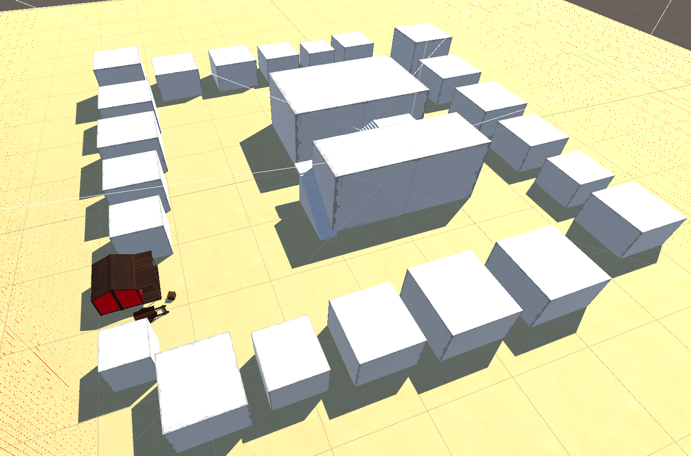
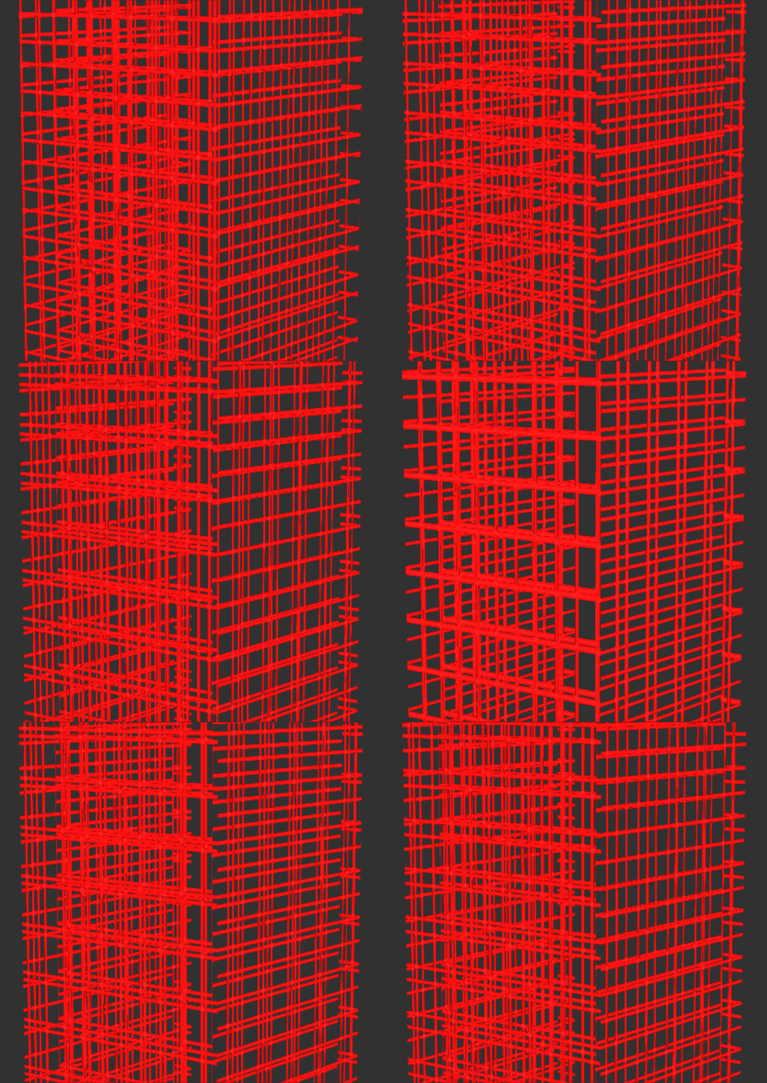
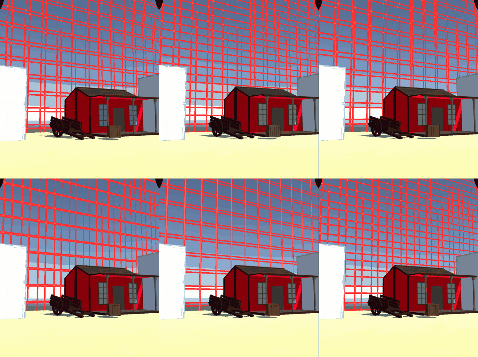
A boundary was put in around the level to prevent the player getting outside. To match the setting of being inside a simulation, an animated simulation-like grid pattern was designed that surrounds the level from the floor to the sky. Brodie based this grid pattern from a YouTube tutorial by UGuruz.
Below is an example of the shader on a custom mesh, as well as an example of how it looks as a wall.
User interface
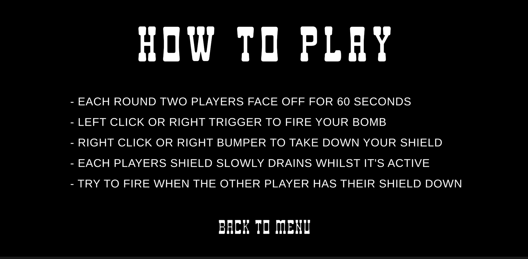
New menu scenes were added to flesh out the main menu that was added last week. There is now a how to play screen (to be finalised) that shows the player information about how to play the game.
Unfortunately the font we've chosen doesn't support any non alphabetic characters (like symbols) so we've had to resort to a basic sans-serif font for the instructions. The benefit is a basic sans serif font is easier to read at the smaller size.
3D model development
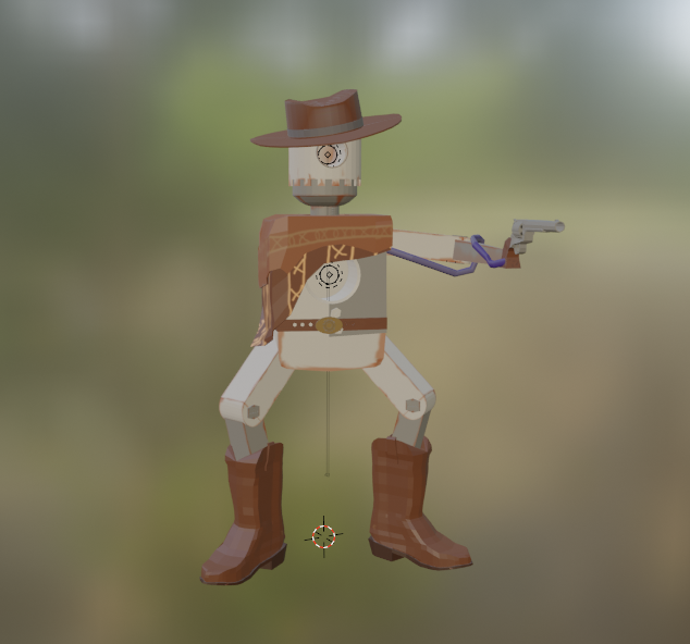
Darius has been continuing work on the main character model with the mesh and texturing complete. Only final touches on rigging remain - there have been some issues with the mesh deforming that should be fixable with weight painting.
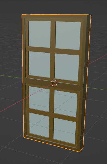
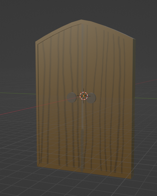
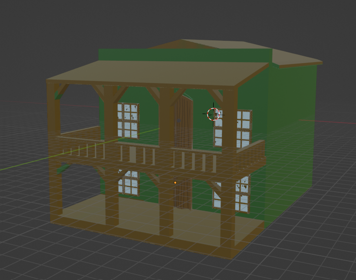
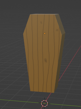
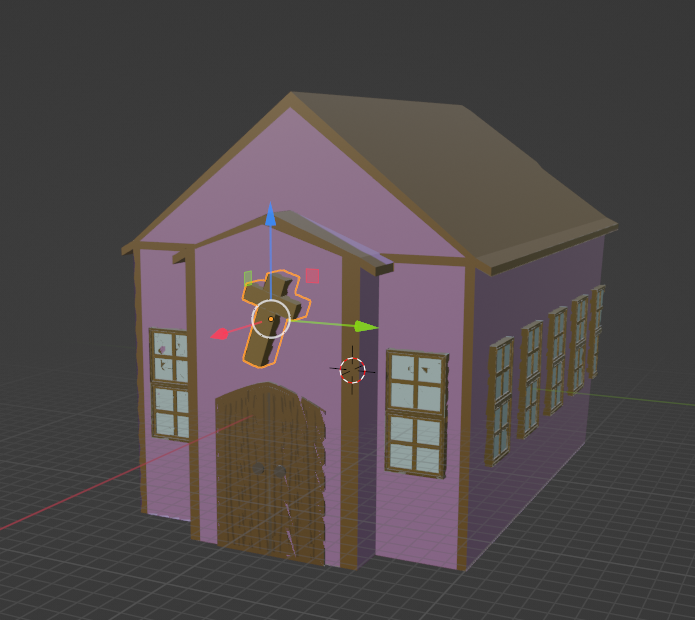
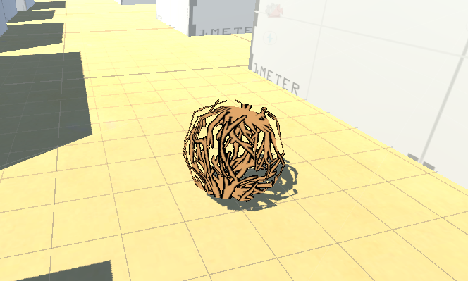
Some various other models were made by Darius - including a window, door, hotel building , church and a coffin. Cade also contributed a saloon building as well as a tumbleweed model.

Files
Get One Shot Standoff
One Shot Standoff
| Status | Released |
| Authors | Brodie Farrell-Oates, kiaric, utasFraser, d.darius.s |
| Genre | Action, Strategy |
| Tags | First-Person, Local multiplayer |
More posts
- Week 13 - PolishOct 11, 2022
- Week 11Oct 01, 2022
- Week 10 - Input systems are a goSep 25, 2022
- Week 8 - Multiple inputsSep 14, 2022

Leave a comment
Log in with itch.io to leave a comment.